Welcome to our first post of 2021! As promised in the previous post to be more regular in posting the various topics in this blog, we are kick starting the year with analytics to discover our top 5 and bottom 5 posts (credit the tops and flops inspiration from one of my colleagues who loves to use that in her weekly review at work), to better understand the content which interests you, the reader!
From the cover slide, we can somewhat see that the traffic has been rather cyclical, perhaps we can expand more on that trend in future but today, let us take a look at the top 5 and bottom 5 posts in the past 6 months. While we are currently 1200 users strong, you might also be interested in looking at our previous Google Analytics Analysis of our first 500 users.
When dealing with analytics, as usual, we want to ask questions which we want to answer. Through the behaviour overview, and full report of Google Analytics we want to know what our best and worst performing posts were.
What are our Top 5?
We were able to discover our top 5 posts (In terms of viewership, from the highest to lowest):
1. Nanyang Business School Business Analytics Module Selection Guide
2. 3 Reasons Why I picked a Specialisation in Business Analytics at Nanyang Business School
3. University Internship Hunting Guide (Tips from NTU NBS Graduate with 3 MNC Internship Experiences)
4. General and Unrestricted Electives Guide – From NBS Business (Business Analytics) Graduate
5. Which Major to Pick? Business Analytics vs Marketing (Ex-NBS Student)
These 5 posts contribute to a total of 37% of all our page views, even though they made up about 25% of all content.
What are our Flop 5?
We also managed to pick out our flop 5 posts (From the lowest to highest in viewership):
1. COVID-19 Pandemic: Should I Start Work or Go Back to School?
2. Business Model Template: Photo Studio
3. 6 things to do for 2 Hours in Stuttgart, Germany
4. Integrating Analytics and Management: Where and How to Start?
5. Key Takeaways from my In-office turned Work-from-Home Internship
These 5 posts contribute to 4.2% of all our page views, much less than the 25% of all our posts in 2020.
Additional Remark: The clear bottom fodders were the newer posts of Christmas Text Analytics and Hair Salon Business Model which we would exclude from the analysis as they have yet to pick up, but I urge you to take a read as they are really interesting posts!
Making sense of the insights
From the top 5 posts, there is a clear indication that many students visit us and rely on the information posted here for advice on their curriculum needs. We are really humbled to be able to create impact for the student audience as we always try to pay it forward after learning from the knowledge of seniors and we urge you to pay it forward in future too!
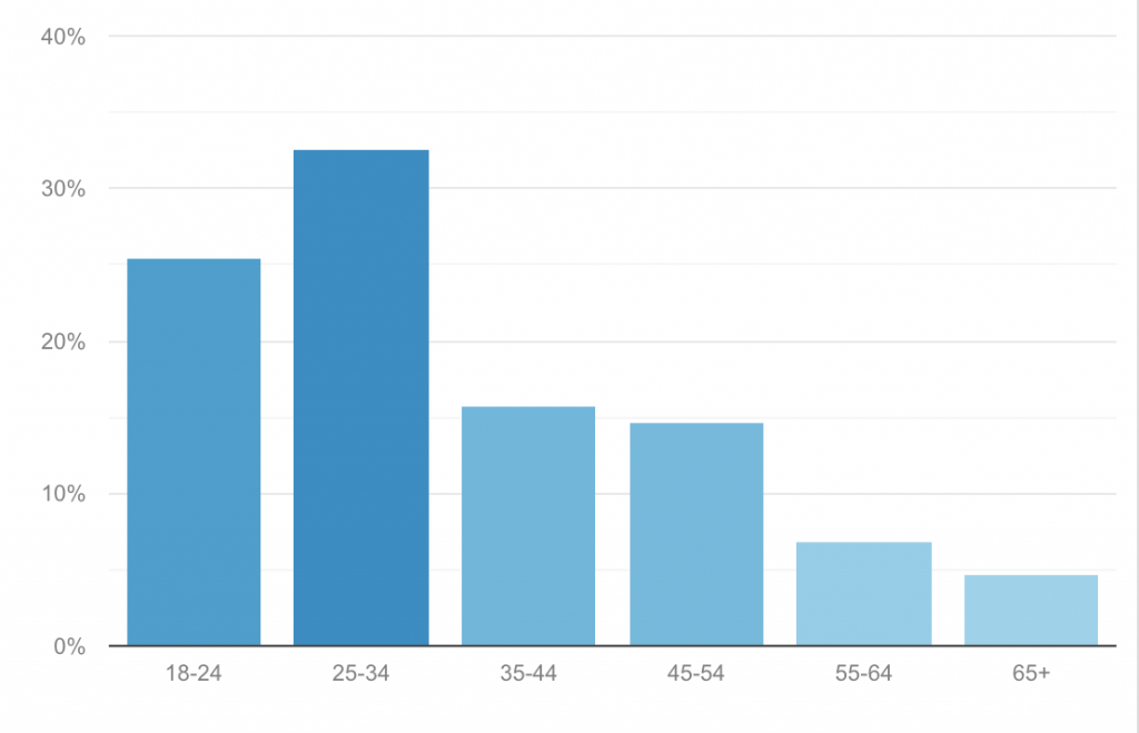
We also noticed that it was an interesting trend that 40% of our users are a non-youth audience, and we are heartened that we are able to communicate analytics and innovation to an audience that we initially did not imagine to create impact for. Do let us know which content you love in the comments below!
For the flop 5 posts, one of the central themes which surround these posts is for instance, it being no longer specific to analytics, which we relaunched the blog on (yes we used to include lifestyle posts and travel.), or the very slight reference to the epidemic which shall not be named since this is risk of lowering the search engine score of this post (we instantly apply these insights!!). We hope to continue bringing new content and will continue to generate more content which caters to your hunger for learning about analytics, innovation and management!
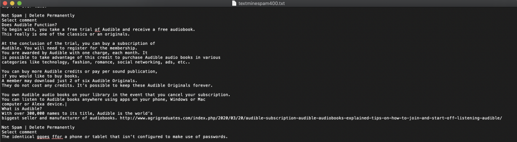
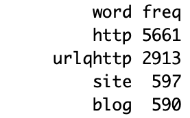
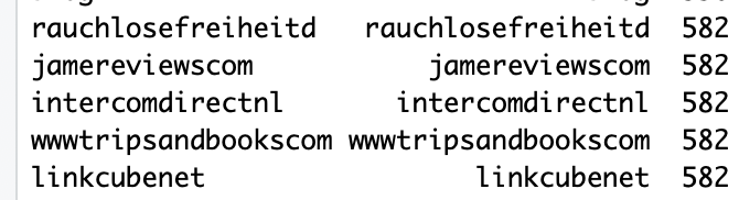
Additional note: We initially wanted to add in a text analytics, but we realised that there isn’t enough posts to do that on this post without getting just words that are repeated non-stop. If you liked the text analytics, you could look at our ranked 6th post, What I learned from Text Mining 400 Spam Comments on my Blog using R, to see what spam users like to write in our comments section.
If you liked our post, do bookmark this site, or follow us on our LinkedIn page as we look forward to creating new content for you every week. Wishing you a Happy 2021!!!
Image Credits: Original Image created by Tan Wei Xiang